Page 36 of 47
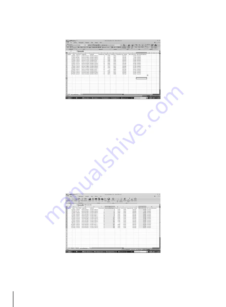
The data is now in the form of an Excel spreadsheet and can be minupilated to create suitable graphs.
In the example above, the Distance column is filled automatically, as the GPS option was used when data was
collected. If GPS was not used, the distance between measurements will have to be inserted manually.
It is advisable to insert a column in the spreadsheet for acumilated distance (This process is automatically done
on some recent software revisions). This will make the graphing process easier.
This can be done long hand or doing the following will speed up the action.
1. Insert a column by right clicking over the Depth (m) column and select insert column. Name the new column
“Accumulated Distance”.
2. Insert 0 at the top cell, first Accumulated Distance.
3. Place the pointer over the second empty Accumulated Distance cell and key in “=”, then click on the second
Distance cell, then key in “+”, then click on the first Accumulated Distance cell in the Excel sheet. Now press
“Enter” on the keyboard, the second Accumulated Distance is calculated.
4. Now left click on the corner of second Accumulated Distance cell and drag the corner of the box down to the
bottom of the column. The boxes should fill with the Accumulated Distance as below.
8
Interpreting Results
• It is now possible to generate a graph. Graphs are most commonly done as DM Current against Distance.
• Highlight the Accumulated Distance records and then press the “Ctrl” key whilst highlighting the DM Current
column.
• From the “Insert” tab, select “Scatter Plot”. And from the menu, select the desired graph. The graph will then
be generated as below.
Summary of Contents for vLocDM
Page 1: ...vLocDM User Handbook English Edition Version 2 1...
Page 2: ......
Page 3: ......
Page 4: ......


