


OmegaView Version 1.4x
8
•
The graph plots each data channel using a different color and dot style. A small rectangular legend shows the
color and the dot style of each channel. This legend can be moved by clicking the left mouse button while
inside the legend and dragging the legend to where you want it to be. The legend can be turned ON and OFF by
pressing the
button on the toolbar.
•
There is an additional legend above each of the Y axis. This legend is the channel name drawn in the same color
as the channel line on the graph. This legend helps identify which channel belongs to which axis. For instance,
in the graph above, the
Temperature
in red and
Dew Point
in green correspond to the left Y axis, the
Relative
Humidity
in blue corresponds to the right Y axis.
•
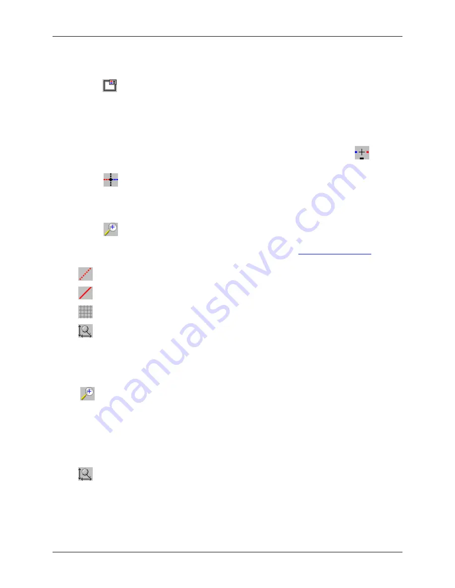
The Cursor Location Markers show the cursor position on the graph. The position is shown on each of the axis
in a slightly larger, bold text. The position indicators can be turned ON and OFF by pressing the
button on
the toolbar
•
Clicking the
button activates the sample marker function. When this function is active, clicking a point on
the graph, marks this point, and shows the point values for all channels, at the specified time. An example of
sample markers is shown above.
•
During zoom mode, you can use the vertical and horizontal scroll bars to move the graph around.
•
Clicking the
button activates the zoom mode. To zoom to an area, click the left mouse button at one corner
and drag the mouse, while holding down the button, to the opposite corner. Releasing the button will activate
the zoom. Clicking the right mouse button unzooms the graph one level. See
for more details.
•
The
button turns ON and OFF the marks at the data points.
•
The
button connects the sample points with a line.
•
The
button turns the grid lines ON and OFF.
•
The
button on the toolbar causes the graph to unzoom to the full scale of the recorded data. This means
that the minimum and maximum scale will be about equivalent to the minimum and the maximum of the data.
Using the Zoom Feature
There are a number of ways to zoom to the data you would like to see on the screen. To activate the graphic zoom,
click the
button on the toolbar. The graphics window has to be selected for this button to be active.
•
Graphic Zoom
: You can graphically zoom on the portion of the data that is displayed on the screen by pressing
the left mouse button and dragging the box around the part of the graph you would like to zoom to. You can
repeat this until the graph is zoomed to just a few points. Pressing the right mouse button reverses the graphic
zoom (causes unzoom).
•
Unzoom
: Pressing the left mouse button, then releasing it without dragging the mouse causes the graph to
unzoom (zoom out). Pressing the right mouse button reverses this zoom.
•
The
button on the toolbar causes the graph to unzoom to the full scale of the data. This means that the
minimum and maximum scale will be about equivalent to the minimum and the maximum of the data.
•
Autoscaling a specific axis
: You can also autoscale the time or one of the data axes only, without affecting the
other axes. To autoscale the time axis only, choose
Time -> Auto Scale
from the
Zoom
menu. To autoscale
one of the data axis only, choose
Auto Scale
for the appropriate channel from the
Zoom
menu.
Summary of Contents for OM-70 Series
Page 19: ......


