Page
54
of
76
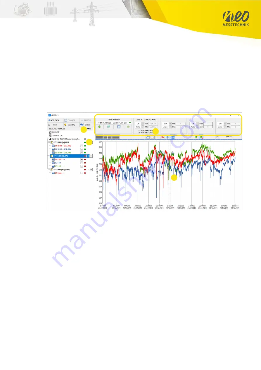
Overview Data visualization panel
Selected Quantities (1)
By pressing on the green indication lamp you can enable/disable individual quantities
or phases (2) for the Visualization
Configuration of Visualization (3)
-
x-y axis (scaling, lin/log)
-
interpolation type
-
point style
-
number of charts
-
Cursors
-
Zoom In/out Function
-
Time-Interval
Data Visualization (4)
If you want to add additional channels, just press “Add” again and select the quantities you
want to add.
Key Feature:
You can also add data of multiple data files respectively data files recorded by
other instruments. In that way, you can analyse data of multiple different measurement
points, which are synchronized by GPS clock, together. This allows powerful and highly
synchronized data analysis.
Key Feature II:
In the same Graph you can show 10-period, ½ period and Waveform data
1
3
4
2
Summary of Contents for PQA8000
Page 32: ...Page 32 of 76...


