Page 66 of 90
Issue: 0.4
Price Function
© Gyr Commercial in Confidence. © Gyr
P450 In Home Energy Monitor - DRAFT User Manual
The elements that make up this screen are:
1.
Details of the currently active rate.
2.
Countdown timer to the next rate change
3.
Details of the next active rate
4.
Navigation to the next tariff screen in the sequence (via the Outlook button)
In this screen, the cost per unit and the frame around the other rate specific information will be
expressed in a colour. ‘Low’ rates will be framed in
green
and ‘high’
rates in red.
12.4 Price outlook
The next display in the price sequence is Price Outlook. This is the main viewer of price parameters
and details.
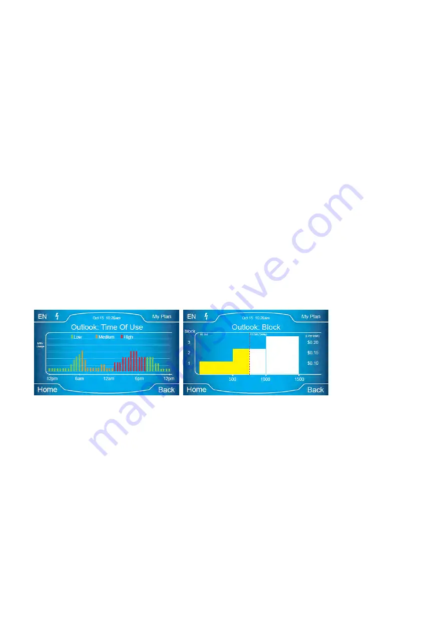
The main elements on view are:
1.
Usage profile color highlighted depending on rate price.
2.
Rate and Price indication
3.
Navigation to the next tariff screen in the sequence
The outlook screen can be seen in the following example.
Figure 85 Price Outlook Screen
12.4.1 Usage profile
The usage profile shown in the outlook screen is based on the profiled usage information described in
the history section.
Profiled usage is re-shown here and associated to the price information. The combination creates
actionable information for the user; i.e. clear examples of peaks in usage (shown in the profile) with
amber or red rate periods overlaid to suggest or prompt voluntary peak shifting from customer
behavioural change.
12.4.2 Rate indication
The green, amber, red labelling scheme is used to describe individual Time of Use rates within a
Price.
‘Low’ rates
are
shown in green, ‘transition’ or ‘mid’ rates
in amber and ‘high’ tariffs in red; this
will use the same logic and identification as the tariff status screen.


