Processor Utilization, by the Hour
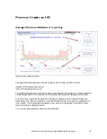
Hourly Processor Utilization Graph.
The Processor Utilization by Hour graph shows the hourly processor utilization average during
the last 30-day period, based on the system’s current configuration. This allows you to see how
the workload changes during a day.
The time indication, 08 for example, represents the time range 08:00 through 08:59.
If there is a published rPerf rating for this model, the graph will display the utilization
measured in rPerfs as well as a percentage of total capacity.
The crosshatch area (green) indicates system jobs (e.g. OS)
The forward slash (red) area indicates user (non-system) jobs.
The blue line shows the busiest hour of total peak CPU utilization for that hour during the last
30 day period. It is likely that your system experienced a degradation of throughput on some
day during the period, if this percentage is high during a long period.
PM for Power Systems Graph Reference Document
23


