7
Do not change other options. Click OK.
6.
In the same way import to the Column C4 the pressure data from the ‘Trend pressure’.
7.
Open the Create/Edit Table dialog by clicking the
Create/Edit Table
menu option.
Make data ranges C3 and C4 invisible.
For C5 select ‘Formula’ and create, using the Formula Wizard, the formula [p-
pulse] – [p-trend]. Name this quantity ‘p-difference’. Make this column also
invisible.
8.
Create a new diagram with the name Envelope curve.
Select for the data range C1 ‘Manual: p-trend’.
Select for the data range C1 ‘Formula: p-difference’.
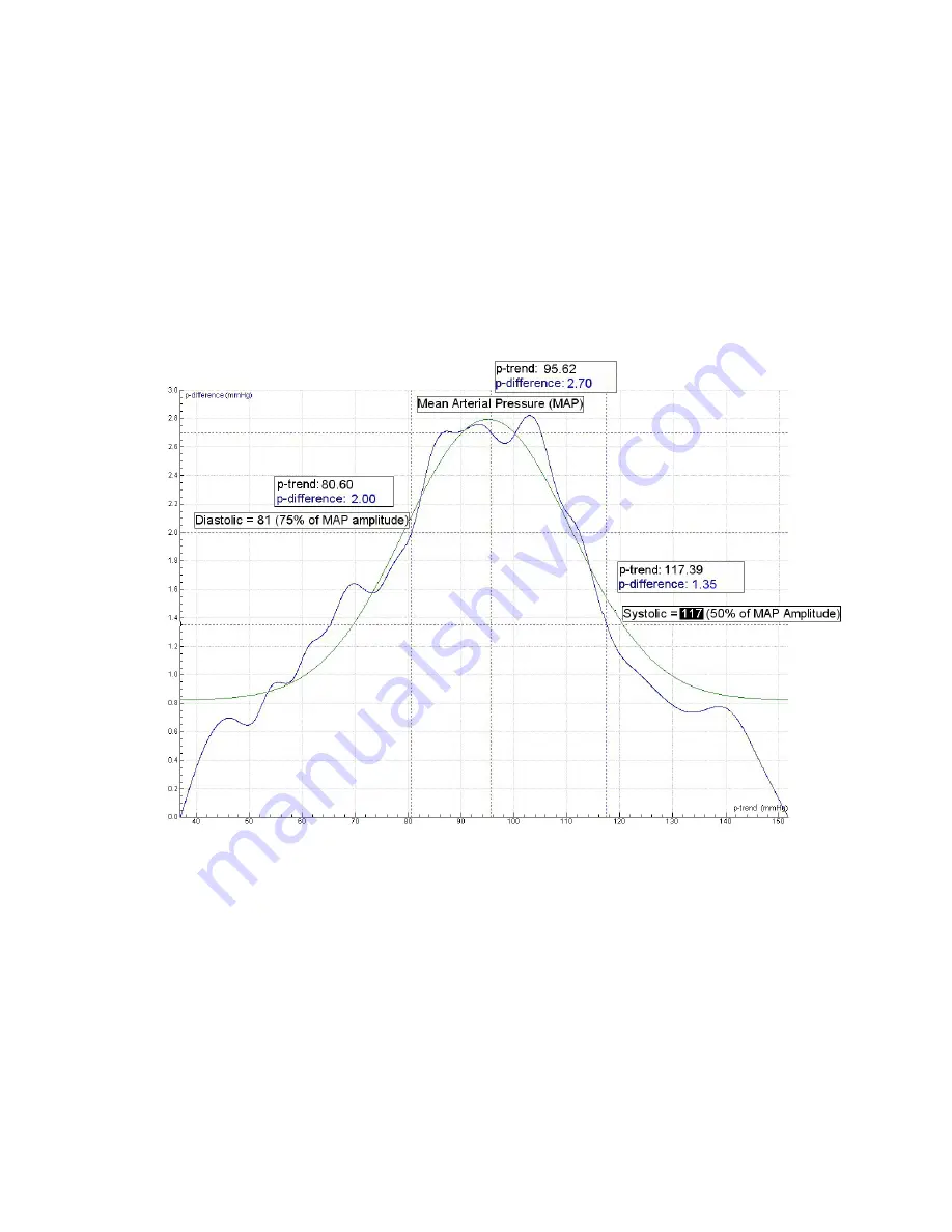
An example of a bell shaped envelope curve is shown in the diagram below.
Figure 8:
A bell shaped “envelope curve” vs. the trend pressure. As blood pressure values
are usually rounded to 5 mmHg we find a blood pressure of 120/80. A best-fit bell-shape
envelope is sketched in the graph to find the maximum (MAP).


