54
APPENDIX I – Common Icons and Graphics
Icon Meaning
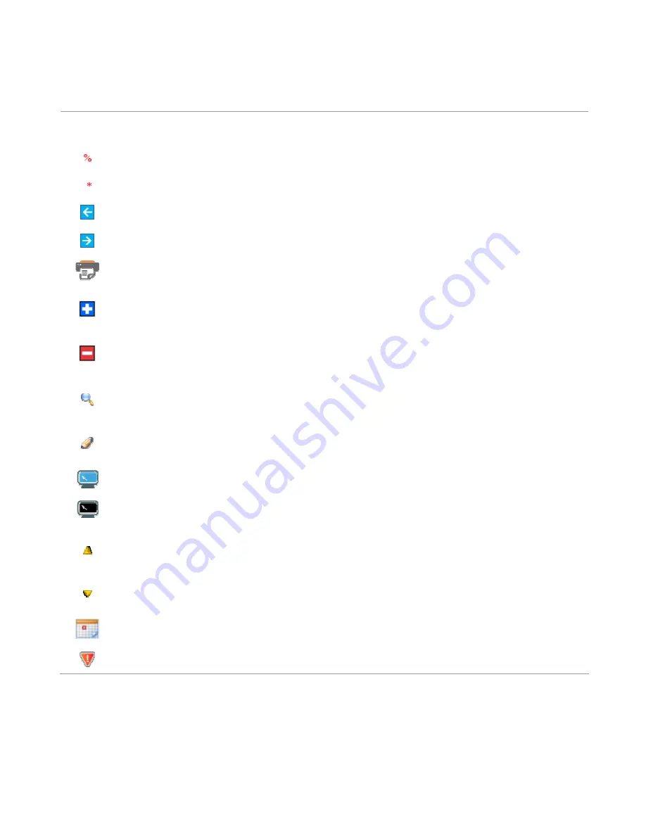
Wildcard icon – indicates that the field is wildcard enabled
Mandatory icon – indicates that the field is required in order to proceed
Previous/Cancel icon – clickable button that returns the User to the previous page
Next icon – clickable button that allows the User to skip the current step
Print icon – clickable button that opens the Print Dialog box for printing the current page
Add icon – clickable button that opens expandable sections permitting for the addition of Additional
Notifications
Remove icon – clickable button that closes expandable sections permitting the removal of
Additional Notifications
Select icon – clickable button that redirects the User to view additional details of an entity
represented as a row within a DataGrid (Tabular data).
Edit icon – clickable button that redirects the User to edit the entity represented as a row within a
DataGrid (Tabular data).
Indicates that the Datagrid (Tabula data) has the paging feature enabled
Indicates that the Datagrid (Tabula data) has the paging feature is not enabled
Arrow Up icon – indicates that the DataGrid (Tabular data) is sorted in ascending order by the
column possessing the icon
Arrow Down icon – indicates that the DataGrid (Tabular data) is sorted in descending order by the
column possessing the icon
Calendar button.
Indicates that infringements are recorded against the voyage.
Summary of Contents for CERS Port
Page 59: ...59 Port User New Arrival Notification...
Page 60: ...60 Port User New Reportable Departure Notification...
Page 61: ...61 Port User Reporting Of Infringements...
Page 62: ...62 Port User Search Voyages...
Page 63: ...63 Port User Edit or Cancel Voyages Port User Add or Edit Infringements...


