HCT User Guide
page 16
Copyright © 2001 HutchColor, LLC
User_Guide_43.docx 2/10/19
may need different profiles, but a profile made for the latest generation of Kodachrome should work well
with older Kodachromes.
•
Tape the Kodachromes together to form a collage at least 4 inches by 5 inches in size.
•
Scan the collage using the same setup as the HCT target. In Photoshop, open both the HCT
scan and the Kodachrome collage scan, then assign the normal ICC scanner profile to both.
•
On the Kodachrome collage scan, open the Layers window and create an Adjustment Layer
Group (“Set” in older Photoshop versions). Make a Curves adjustment layer and above it, create
a Hue/Saturation adjustment layer, but do not apply any edits to either layer.
•
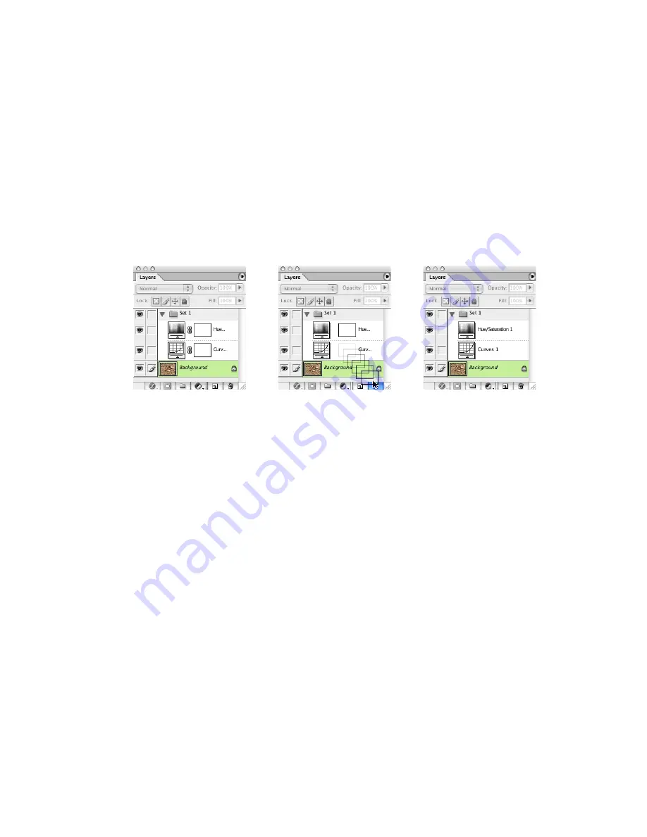
Disconnect the masks that appeared automatically on each adjustment layer by clicking their
‘chain’ icons, then dragging the masks into the trash can at the bottom of the Layers window.
Removing the layer masks from the Adjustment Layer Set
•
Remove the collage of original Kodachromes from the scanner and place it, along with the
original HCT, in a D-50 transparency viewer dimmed to match the brightness of the monitor.
The HCT scan should look similar to the actual HCT target. If not, either adjust the intensity of
the viewing booth, or adjust the color balance of the monitor, or re-create the scanner and/or
monitor profiles until the displayed HCT scan matches the target as closely as possible.
Correcting gray balance
•
Compare the displayed collage with the actual Kodachrome originals in terms of overall gray
balance. Ask yourself; “Is the screen image too red, too yellow, too green, too cyan, too blue,
too magenta, or a combination of these errors?”
HINT
: Scanned Kodachromes are usually too blue, or lacking in yellow dye density. Typically this bluish
cast is most noticeable in mid-tones, becoming less obvious towards highlight and shadow regions.
Occasionally there may be a different type of color cast in highlights or shadows, but this usually
indicates a scanner problem, and is not normally an emulsion-based effect.
•
To correct any apparent gray balance error, edit the Red, Green and/or Blue curves of the
“Curves 1” layer, ideally with one mid-tone curve point, or at the most two or three curve points.
The goal is to make the gray areas on screen look as close as possible to the same gray areas
in the physical transparencies.
•
Continue until all near-gray areas in the displayed images match the same areas in the physical
Kodachrome transparencies as closely as possible.
IMPORTANT
: At this stage, IGNORE any errors in saturated colors. For example, if reds are too “cool” or
yellows are too “green”, do NOT attempt to correct these errors with Curves.
Содержание HCT
Страница 1: ...USER GUIDE Version 43 February 2019 ...


