User manual MKA 120
Conforms to
Issue 07.07.2021_01 Page 10
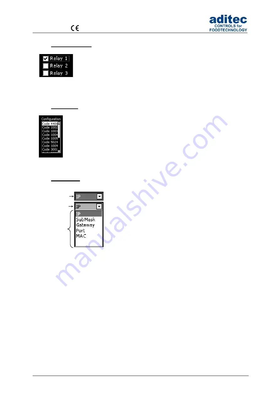
4.4 Check boxes
Check boxes allow you to set e.g. a state. When a check box is focussed
(frame
around the info text)
you can change its state to
selected (Relay 1)
or
not
selected (Relay 2,3)
by using the ‚Line‘ button. If several check boxes exist you
can use the
arrow buttons “up” or “down” respectively to focus the following or
previous check box.
4.5 List box
List boxes allow you to clearly display e.g. codes in a list. Use the
arrow buttons “up”
and “down” to focus an entry
(background = white, writing = black)
and the
‚Line‘
button to select it. The status bar gives you only an overview. The scroll bar is
automatically moved when the last item of the visible segment is focussed with the
arrow buttons
4.6 Drop box
A drop box is used to select one item from a shown list of items.
Initially, the previously selected item is shown. Use the arrow
buttons “up” or “down” respectively to focus the following or
previous item. When you press the
‚Start‘ button, a list of all
available items on the list will flick open and you can use the
arrow buttons “up” or “down” respectively to focus the following
or previous item.
(background = grey, writing = white)
. The
currently selected item is shown on the menu tab. Use the
‚Time‘ button to shut the drop box and the newly chosen item is
automatically selected.
Figure 4: check
boxes
Figure 6:
Drop box
Menu tab
Drop box
Menu
Figure 5: List box


