PowerSoft
PowerSoft – Instruction manual
41
the graph are described. The coloured rectangle is the reference to the
colour of the trace.
In the same row of the legend title, there are two buttons. The left one
disables the displaying of the relevant trend (it is green if the trace is
enabled, red if disabled). Clicking on the right one, the variable selection
dialogue box appears.
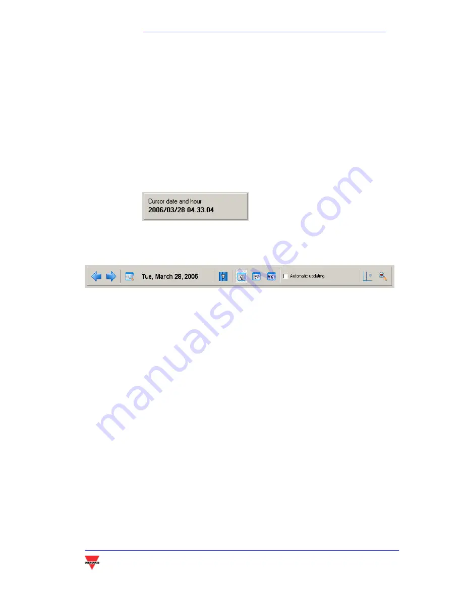
Below the legend, a square indicates the date and time pointed by the
mouse cursor.
In the top of the window there is the graph tool bar.
The tool bar includes:
The date of the displayed data.
The displayed time interval. If
1
is selected, the time interval is 1
day.
7
means one week and 31 one month. The displayed
week or month are the ones including the date on the tool
bar.
If the
PWS Tariff
module is available, selecting
T
it is possible to
display in the graph background the different tariffs,
represented by different colours.
It is possible to enable the
automatic updating
of the graph, which
is updated every time a new value is acquired from the
system.
5.3.2
C
REATING A REPORT
(
TREND
)
The first step to create a report is to select the (up to 4) variables to be
shown in the table. For this purpose, the cross-shaped buttons on the
Summary of Contents for POWERSOFT
Page 1: ...POWERSOFT INSTRUCTION MANUAL...
Page 4: ...PowerSoft PowerSoft Instruction manual 4 INTRODUCTION...
Page 10: ...PowerSoft PowerSoft Instruction manual 10 2 INSTALLING POWERSOFT...
Page 15: ...PowerSoft PowerSoft Instruction manual 15 3 OPERATING POWERSOFT...
Page 28: ...PowerSoft PowerSoft Instruction manual 28...
Page 29: ...PowerSoft PowerSoft Instruction manual 29 4 SOFTWARE SAFETY...
Page 35: ...PowerSoft PowerSoft Instruction manual 35 5 ADDITIONAL MODULES...


