background image


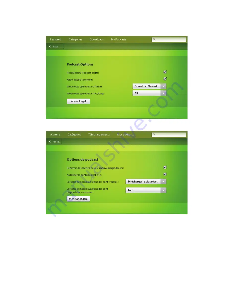
• Try to avoid displaying truncated text. The meaning might be unclear to users if the most important text does not 

appear. First, try to reduce the size of the text. If you reduce the size but you cannot read the text easily, try wrapping 
the text onto two lines instead. If you cannot wrap the text, consider using an abbreviation. Otherwise, use an ellipsis 
(...) to indicate that the text is truncated.

• Make arrangements for displaying the position of a contact's title, full name, and address on a per-language basis. 

These items display in a different order, depending on the language (for example, title, first name, last name, or last 

UI Guidelines

Localization

34 

Summary of Contents for PlayBook Tablet

Page 1: ...BlackBerry PlayBook Tablet Version 2 1 UI Guidelines ...

Page 2: ...Published 2012 10 30 SWD 20121030095059822 ...

Page 3: ... 9 Simplify the functionality 10 Make your application touch centric 12 Screen design 14 Menus 14 Text 15 Title bars 18 Dialog boxes 18 Notifications and indicators 19 UI components 21 Buttons 21 Check boxes 21 Radio buttons 22 Segmented controls 23 Toggle switches 23 Text fields 24 Lists 26 Pickers 27 Media controls 28 Activity indicators and progress indicators 29 Application icons 32 Localizati...

Page 4: ...practice Designing applications for different languages and regions 33 Best practice Coding for different languages and regions 35 Best practice Writing for different languages and regions 36 Legal notice 37 ...

Page 5: ...rate these core design principles In addition to these principles consider the attributes that are important to the majority of your users For example most game enthusiasts want to play games that are entertaining visually appealing and challenging In contrast organizations want utility applications that increase efficiency and productivity The design process involves evaluating choices and making...

Page 6: ...vices and computers Mobile devices have the following characteristics Characteristic Guideline Smaller screen size Stay focused on the user s immediate task Display only the information that users need at any given moment For example a customer relationship management system can provide a massive amount of information but users only require a small amount of that information at one time Design the...

Page 7: ...here possible Slower processor speeds can affect how users perceive the responsiveness of an application Less available memory Free up as much memory as possible For example while an application is not being used try to keep it from using memory UI Guidelines Designing applications 7 ...

Page 8: ...rs that they can view more albums by swiping up or down on the screen Use a canvas strategy The large area of a typical computer interface allows you to present an application with a mix of content and UI components The same application that is created for the BlackBerry PlayBook tablet requires a different strategy In most situations your application should make use of the entire screen use gestu...

Page 9: ...wing users to move pan slowly through the content move quickly zoom in and out and perhaps rotate On a discrete canvas you should also consider allowing users to move shift slowly or quickly through the content but there are likely some other actions that you might want to enable using gestures For example you can flip over a card navigate within a contact list or jump to the next chapter in a doc...

Page 10: ...ents on the main screen but do so judiciously Reserve the majority of the screen for users to interact with the content in your application If you include a UI component make sure that you give users an unobstructed view of the content For example display media player components at the bottom of the screen to allow users a clear view of the list of available songs Simplify the functionality Identi...

Page 11: ...ible This could be as easy as opening the numeric keyboard for a user to type a phone number in a field or capturing data using other means such as GPS a Bluetooth enabled sensor a camera or an accelerometer Limiting the data that users need to input can reduce the burden on users and greatly improve the usability of your application Another way to support user data input is to make sure that you ...

Page 12: ...ns These gestures include the following Gesture Expected result Swipe from the top of the screen Displays a menu for settings or options Swipe from the left or right side of the screen Switches applications Swipe from the top corners of the screen Displays application notifications and status indicators Swipe from the bottom left corner of the screen Displays the keyboard Interactions with content...

Page 13: ...and around the edge of the screen especially along the top and bottom of the screen Otherwise users might inadvertently open a menu or display the application list Use a target area of at least 5 5 mm for custom UI components or at least 4 mm if the component extends across the full width of the screen It s a good idea to test the size of the target area with users Components need to be large enou...

Page 14: ...s designed to transition seamlessly if users switch between views Best practices Place important information near the top of the screen Think top down when laying out your screen Avoid placing content where common interactions too often obstruct it Position UI components close to where users thumbs would be when holding the tablet Use BlackBerry UI components where possible so that your applicatio...

Page 15: ...courages reading and is inconsistent with the UI of the BlackBerry PlayBook tablet If a complex concept must be explained consider adding it to a Help screen Avoid using trademarks or other symbols on the UI Add these to an About screen instead Place labels to the left of UI components in most languages The only exceptions are check boxes and radio buttons which should have the labels to the right...

Page 16: ...re they always appear identical Best practices Do not use colons to terminate labels Colons don t add any value when a label is adjacent to its UI component Instead vertically align multiple labels to the left leaving space between the labels and the related UI components Avoid unnecessary end punctuation Complete sentences end with a period but short phrases and lists typically do not Avoid using...

Page 17: ...rify make sure provide or check instead erase v Use delete instead hang v Use stop responding instead image n Use in the context of the browser and HTML messages Use picture in the context of the camera and media applications keypad n Use keyboard instead memory card n Use media card instead navigator n Use multitasking view to describe the section of the home screen that displays open but minimiz...

Page 18: ...n your application For example a title bar can show users where they are in relation to where they have been Avoid including a title bar for an application with only one screen Dialog boxes Dialog boxes should be used sparingly because they interrupt user workflow Instead provide information in line with a specific item where possible For example if a user doesn t complete a required field in a fo...

Page 19: ...plication to proceed Use an implicit save model where possible For example when setting options apply each setting as the user changes it Some exceptions exist For example if a user chooses to close a document that is being edited you can use a dialog box to prompt the user to save changes Notifications and indicators Application notification icons appear in the top left corner of the home screen ...

Page 20: ...events that users want to be notified of Test your notification strategy with users to avoid unnecessary distractions or interruptions Do not use application notifications to provide feedback to users such as providing confirmation of a specific user action Avoid using ellipses to indicate progress Ellipses should be used only to indicate truncated text Instead provide other visual indicators such...

Page 21: ...of text if space is limited and the icon is easily understandable in the context Check boxes Use check boxes when users can select multiple items or options Users tap a check box to select or clear it You can use check boxes to allow users to select items before applying an action For example users can select multiple pictures and then delete them If you have only a few options to present to the u...

Page 22: ...abels where possible For example use Show instead of Hide Place labels on the right side of check boxes Use sentence case capitalization for the individual check boxes in a group Capitalize the first word and any other word that requires capitalization such as a proper noun Do not use end punctuation Radio buttons Use radio buttons to indicate a set of mutually exclusive but related choices Users ...

Page 23: ...d punctuation Segmented controls A segmented control is a series of connected radio buttons You can use segmented controls to allow users to filter or change the content that is displayed on the screen Users tap a segmented control to see a list of values Users can tap a value to select it Best practices Group and order controls logically For example group related options together or include the m...

Page 24: ...input that is required In addition to the default keyboard you can choose from a selection of keyboards such as a keyboard designed for typing in an email or a keyboard designed for typing in a browser For example if users need to type an address for a website you can display the URL keyboard which includes a com button that lets users type the URL for a website more quickly For each text field in...

Page 25: ...rry PlayBook tablet is connected to a physical keyboard do not open the virtual keyboard automatically when users need to type text Suppress word prediction in text fields that will probably include text that is not likely to be in the dictionary for example in password phone number URL email and name fields When users are typing they might be annoyed if the keyboard tries to predict words for the...

Page 26: ...action such as cut or copy text Lists You can use different types of lists in your application Users can swipe across the screen to move through a list Users can tap an item in the list to select it Use drop down lists to provide a set of mutually exclusive values UI Guidelines UI components 26 ...

Page 27: ... section tile lists to organize groups of items in a grid Pickers You can use pickers to help users easily choose an item from an ordered list For example you can use a picker to allow users to change the time or select a birthday Users can swipe across the screen to move through a picker Users can tap an item to select it UI Guidelines UI components 27 ...

Page 28: ... song or video by tapping the specific control Users can fast forward or rewind a song or video by dragging a finger over the slider Similarly users can adjust the volume by dragging a finger over the volume slider You can also use a slider to allow users to adjust a value within a finite range for example the brightness or size of an item UI Guidelines UI components 28 ...

Page 29: ...s Activity indicators and progress indicators show users that their BlackBerry PlayBook tablet is performing an action such as searching for items or connecting to a Wi Fi network Users cannot interact with these indicators If you can determine the duration of an action use a progress indicator UI Guidelines UI components 29 ...

Page 30: ...re downloading an application indicate the percentage of data that has been downloaded Be as accurate as possible with the progress information For progress indicators use concise descriptive text to indicate what the action is for example Loading data or Building an application list If an action takes a long time and you want to communicate what is happening at each stage provide text that descri...

Page 31: ... Use sentence case capitalization Capitalize the first word and any other word that requires capitalization such as a proper noun UI Guidelines UI components 31 ...

Page 32: ... x 90 pixels will not be displayed on the screen Resolution 72 pixels per inch PPI Mode RGB color Type PNG Keep the main graphical elements of the icon within a 77 x 77 pixel area which allows for a buffer zone If the main graphical elements occupy the entire 86 x 86 pixel area the icon will look too large in the application list You can accessorize outside of the 77 x 77 pixel area but the main g...

Page 33: ...Early in the design process consider whether your application might require localization If your application does not require localization now consider designing your application so that it would be easy to localize it in the future Be aware that even if your application might not be localized some users might want to type text in other languages in your application Best practice Designing applica...

Page 34: ...ry wrapping the text onto two lines instead If you cannot wrap the text consider using an abbreviation Otherwise use an ellipsis to indicate that the text is truncated Make arrangements for displaying the position of a contact s title full name and address on a per language basis These items display in a different order depending on the language for example title first name last name or last UI Gu...

Page 35: ...g partial strings to form a sentence When translated the strings might not produce a logical sentence Create a new string for the sentence instead Avoid using variables in place of nouns for example The X is locked Instead create a specific string for each noun Even if the sentence appears correctly in English in some languages if a noun is singular or plural and masculine or feminine the rest of ...

Page 36: ...tes and time formats reflect the locale of your users Best practice Writing for different languages and regions Include subjects where possible For example use the list that appears when you type instead of the list that appears when typing Include articles where possible For example use press the Power button instead of press Power Use relative pronouns where possible For example use the email ad...

Page 37: ...ency links or any other aspect of Third Party Products and Services The inclusion of a reference to Third Party Products and Services in this documentation does not imply endorsement by RIM of the Third Party Products and Services or the third party in any way EXCEPT TO THE EXTENT SPECIFICALLY PROHIBITED BY APPLICABLE LAW IN YOUR JURISDICTION ALL CONDITIONS ENDORSEMENTS GUARANTEES REPRESENTATIONS ...

Page 38: ...has agreed to support all of their features Some airtime service providers might not offer Internet browsing functionality with a subscription to the BlackBerry Internet Service Check with your service provider for availability roaming arrangements service plans and features Installation or use of Third Party Products and Services with RIM s products and services may require one or more patent tra...

Page 39: ...Waterloo ON N2L 3W8 Canada Research In Motion UK Limited 200 Bath Road Slough Berkshire SL1 3XE United Kingdom Published in Canada UI Guidelines Legal notice 39 ...

Reviews: