background image

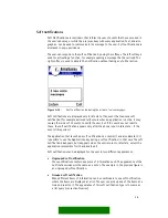
single-line item with graphic 


and heading 

Figure 5-26.


small graphic (A), heading text (B), main text (C) 
usage: 
- menu lists 
- selection lists, markable lists 
- multiselection lists 
There is a corresponding component for pop-up 
windows. 

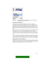
single-line item with


large graphic


Figure 5-27.


large graphic (AB), main text (C)   
usage:  
- menu lists 
- selection lists, markable lists 

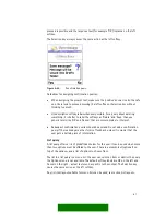
two-line item 


Figure 5-28.


main text (ABC) 
usage: 
- menu lists 
- selection lists 
This layout has one text item that can extend to two 
lines.  

double item 


Figure 5-29.


primary text, secondary text (ABC) 
usage: 
- menu lists 
- selection lists 
This layout has two text lines (primary text on top, 
secondary text below). The second line may be 
empty. 
There is a corresponding component for pop-up 
windows. 


double item with graphic 


Figure 5-30.


46 

Summary of Contents for Series 60

Page 1: ...NOKIA SERIES 60 UI STYLE GUIDE Copyright Nokia Corporation ver 1 4 1 ...

Page 2: ...al discussion about good usability instead this document tries to clarify how the style elements of the Nokia Series 60 user interface are meant to be used in practice The content is also intended to be independent of product specific hardware so that the guidelines would apply to any product that implements the UI style Sometimes this means dropping out things that would be appropriate for one pr...

Page 3: ...OWS 12 MAIN PANE 12 STATUS PANE 13 TITLE PANE 13 CONTEXT PANE 14 NAVI PANE 14 SIGNAL PANE 15 BATTERY PANE UNIVERSAL INDICATOR PANE 15 CONTROL PANE 16 POP UP WINDOWS 16 PRESENTATION OF TEXT 18 JUSTIFICATION 18 TRUNCATION 18 4 INTERACTION STYLE 18 KEYPAD FUNCTIONS 18 KEY PRESSES 18 KEYPAD TONE 19 TYPICAL FUNCTIONS OF THE STANDARD KEYS 19 NAVIGATION 22 NAVIGATING IN APPLICATIONS 22 NAVIGATION USING T...

Page 4: ...0 MENU LIST 30 SELECTION LIST 31 MARKABLE LIST 34 MULTISELECTION LIST 36 SETTING LISTS 37 FORMS 40 LIST LAYOUTS 43 COLUMN STRUCTURE OF LISTS 44 LIST ITEM TYPES 45 NUMBERED ITEMS 48 ITEM TYPE COMBINATIONS 48 GRID TYPES 49 FIND PANE 49 OPTIONS MENU 50 SUBMENUS 51 UNAVAILABLE ITEMS 52 OTHER OPTION MENUS 52 OPTIONS TEMPLATE 53 NOTES 56 SOFT NOTIFICATIONS 58 DISCARDING SOFT NOTIFICATIONS 59 MANY SIMULT...

Page 5: ...RS 67 APPLICATION SPECIFIC INDICATORS 67 6 APPLICATIONS AND DESIGN EXAMPLES 67 IDLE 67 APPLICATION SHELL 68 SHORTCUTS 69 CUSTOMIZING THE APPLICATION SHELL 69 FAST APPLICATION SWAPPING 69 APPLICATION HANDLING 69 OPENING AND CLOSING APPLICATIONS 70 MULTITASKING 70 APPLICATION INTERACTIONS 71 PHONE 72 CALL HANDLING 74 VIEWERS AND PLAYERS 75 TEXT VIEWERS 75 IMAGE VIEWERS 75 MULTIMEDIA VIEWERS 76 AUDIO...

Page 6: ...SELECTING TEXT 80 DOCUMENT HANDLING 80 CREATING NEW DOCUMENTS 80 SAVING EDITED DATA 81 FOLDERS 82 GROUPS 82 FETCHING DATA 83 SETTINGS 83 6 ...

Page 7: ... Guide can be used as an introduction to the style or as reference material It can provide background material to help UI designers make decisions about their product Audience This document is intended in the first place for people who work with application design for devices using the Series 60 UI It will also help persons like product managers to get a general view of the Series 60 UI what it is...

Page 8: ...upport for example an external keyboard One hand operation is a key rule the user is able to do almost all tasks with just one hand pressing the keys with the thumb A few exceptions exist in functions that are targeted to power users and require pressing two keys simultaneously Nokia Series 60 UI is not an optimal user interface for very basic phones All basic phone functions can be done with it b...

Page 9: ...play specifications are as follows Resolution 176 pixels width by 208 pixels height It should be possible to modify the vertical resolution for future generations The first implementation however assumes these resolutions Square pixels Physical size about 35 mm width by 41 mm height Corresponds to approximately 0 2 mm pixel pitch Significantly smaller pixel pitch risks making some fonts too small ...

Page 10: ... effect on the navigation functionality for example a long key press event can t be accomplished with a rotating device Each softkey has a corresponding textual label on the bottom of the screen The Edit key is the only key that can be used simultaneously with another key press for example the combinations where any of the navigation keys are pressed while the Edit key is held down See section Key...

Page 11: ...ther parts of the screen visible around themselves Each application runs in a window of it s own Applications can also use other temporary windows pane Pane means a sub component of a window sub window A window may contain many panes and each pane may contain further sub panes and so on A bottom level component that cannot have a sub component can be called an element Status pane Main pane Control...

Page 12: ...tandard components for applications to use in the main pane a list There are several standard list types to choose from See section Lists and grids for a detailed description of list types a grid There are also several different grid types to choose from find pane Find pane is used together with a list and it allows the user to search list items alphabetically See section Lists and grids for more ...

Page 13: ...rging It occupies the top part of the screen Status pane may be non existent in a few applications or situations Status pane contains the following sub panes Title pane Context pane Navi pane Signal pane Battery pane Universal indicator pane Signal pane Batteery pane Universal indicator pane Context pane Title pane Navi pane Figure 3 2 Status pane areas See the following sections for detailed desc...

Page 14: ...about the current state and view and to help the user navigate in the application Figure 3 5 Navi pane Depending on the context the navi pane can alternatively contain Tabs Figure 3 6 Tabs Used when there are a few different data views that can be viewed alternatively There are arrow indicators in both ends of the widget shown only when there are further tabs hidden in the corresponding direction ...

Page 15: ...tors Figure 3 8 Indicators in the navi pane In editors the navi pane contains editing indicators See the section Indicators for a more detailed description of navi pane indicators Application specific content When none of the above content types is suitable the navi pane content can be designed specifically for an application Empty pane Figure 3 9 Empty navi pane The navi pane can be empty A graph...

Page 16: ...th the two softkeys Figure 3 13 Control pane When there is a list that can be scrolled the scrolling indicator arrows appear between the softkey labels See section Lists and Grids for a detailed description of the indicators Control pane is also active during options menus queries and other states using pop up windows although it does not reside itself in the pop up window The actual softkeys shou...

Page 17: ...ne or more of them in one pass data query contains an input field for a numeric or alphanumeric value that the user can edit Note A note is a feedback component that informs the user about the current situation Notes do not require user input They contain a text and possibly a graphical element the layout is similar to a confirmation query however the softkey labels are typically non existent Soft...

Page 18: ...ly considered less important than the rest 4 INTERACTION STYLE Keypad functions This section describes the typical functions for each key Some application specific functions may exist in addition to the ones mentioned here Key presses A key press is a press and release of a key down and up Typically the primary action of the key is performed when the key is pressed down already before the key is r...

Page 19: ...signed so that this does not cause harm the long key press must never be the only way to do a function Keypad tone A tone can be generated whenever a key event occurs The tones for short key press actually a key down event and long key press are different a key repeat event uses the long key press tone Keypad tone can be adjusted or turned off by the user Typical functions of the standard keys Scr...

Page 20: ...idle a shortcut to a specific application Configurable by the user labeled according to the application Right softkey Typically labeled Back Returns to the previous state See section Application handling for a more detailed description Other labels and functions Exit in application main states Exits the application and returns to idle Cancel interrupts a procedure and returns to the preceding stat...

Page 21: ...g for more detailed descriptions Applications key Brings up the Application shell allowing application launching and swapping When within the Application shell returns to idle Long press of Applications key brings up the quick application swapping window allowing switching between running applications See section Application handling for a more detailed description Numeric keypad 0 9 Numeric and a...

Page 22: ...long key press Opens the Profiles menu for switching active profile Navigation The model of navigation is based on states arranged as hierarchical trees familiar from existing UI concepts A few added features bring in new flexibility Tabs Applications key and the Application shell Direct navigation between sibling folders Links to applications and documents Pinboard These features are described in...

Page 23: ...veral pages of related information into a single state when all of it would not fit onto a single screen or list The user can switch the tabs using the left and right scroll keys as indicated in Navi pane 1 3b 1 3a 1 1 2 1 1 1 1 1 1 1 2 1 2 1 1 3 1 1 3 2 1 3 3 Figure 4 2 In this example state 1 3 uses two tabs to present its information The user moves between views 1 3a and 1 3b using the left and...

Page 24: ...to another although typically they are similar This means that one tab view may have other functions available to the user than another tab view in the same state Folder hierarchies When browsing within a folder hierarchy Series 60 UI offers a direct access from one folder to another sibling folder in the same level The left and right scroll keys are used to accomplish this The Navi pane displays ...

Page 25: ...e other application and navigated to the target state For more information on links see the Application handling section 5 UI COMPONENTS Lists and grids Vertical lists are used extensively in most applications Two dimensional grids are less frequently used but have obvious advantages in some situations In lists and grids the user can move the focus from one item to another using the navigation key...

Page 26: ... first item for an empty list List browsing In a list browsing is possible in two directions pressing scroll up key moves the focus one step up backward and pressing scroll down moves the focus one step down forward When browsing the item in focus must always be visible The detailed rules of moving the focus are as follows If the choice item that is becoming focused is already fully visible all th...

Page 27: ...leads to the first item in the list and vice versa The display of a looping list jumps from the last item to the first item in a non continuous way so that the first item is shown on top of the view just as it would appear if scrolling backward through the whole list This is due to EPOC implementation and is different from traditional Nokia style where the loops appear continuous with no jump in t...

Page 28: ...oll left to move the focus one step left The number of items can be larger than what fits in the view so the grid items may scroll in the view when browsing The preferred scrolling dimension is vertical this means that when more items are added the number of items in a grid grows downward line by line but not outside the window to the left or right A grid should not be scrollable in both dimension...

Page 29: ...ame direction and so on until a filled cell is found When browsing right the focus moves to the following filled cell on the same row If there are no filled cells in that direction on the row the search continues from the beginning of the next row and so on until a filled cell is found Browsing left moves the focus to the previous filled cell on the same row or continues searching from the end of ...

Page 30: ... following list categories can be identified Menu list Selection list Markable list Multi selection list Setting list Form Lists belonging to one category may have different graphical appearances See section List layouts for information about different looking list items Menu list Menu lists are used to select one item from a list and do nothing else the Options command is not available when a men...

Page 31: ...means the user can leave the application open another application and later return to the same state Selection lists are displayed in the main pane Typically the user can open items on a selection list leading into another more detailed view of the item within the application In addition to browsing and selecting items other functions are available in the options menu see section Options menu Usag...

Page 32: ... menu should contain only high priority options associated with the item in focus not general items like Settings or Help The two types of Select key actions should not be mixed within one list one or the other should happen for every item in the list Select4 Figure 5 7 Select action opens a view Select4 Figure 5 8 Select action does a command 32 ...

Page 33: ...elect the item see discussion above Left softkey Options open the options menu see section Options menu Right softkey Back Exit back stepping see section Navigation Clear deletes the item if it can be deleted confirmation from the user required otherwise ignored Edit ignored or marking function if the list is markable see section Markable list numeric keypad may be ignored or may have specific fun...

Page 34: ...ure will typically be applied to lists the user manages containing a large number of items that may be for example sent moved or deleted By marking items first and then selecting a command the user can do some operations more quickly and with less key presses than doing the command separately for each of the items Marked items are indicated graphically The exact style of mark indication is a graph...

Page 35: ...ms become unmarked when the user exits the list for example by back stepping Items remain marked if the user opens and cancels the options menu or swaps applications Pressing and releasing the Edit key alone does not cause any action If the user presses the Select key without Edit when there are marked items on the list then the context specific options menu is opened containing only the functions...

Page 36: ... item When the user accepts the list information about the marked items is passed to the application Items are checked and unchecked using the Select key and the list is accepted with the left softkey Done Note that unlike in a markable list the Options softkey is not available one can only check and uncheck items and then accept or cancel the list Figure 5 12 Multiselection lists in main pane lef...

Page 37: ...or where the value can be changed There are several setting item types available They look the same in the setting list each item displays an attribute text title of the setting on one line and the current value on another line within the item The adjusting and editing functions differ between setting item types pop up setting Pop up setting allows the user to choose one value from a pre defined l...

Page 38: ...ion list The setting item displays the number of selected items versus all items in the value field for example 3 8 Figure 5 15 Multiselection setting text setting The value of a text setting item is an alphanumeric or numeric string The editor can be of some specific type like date time editor Figure 5 16 Text setting slider setting With slider the user can adjust the value of by sliding a marker...

Page 39: ...ored text editing mode menu slider ignored numeric keypad pop up multiselection ignored text input functions slider ignored if the value is numeric it may be adjustable using the numeric keys other keys cancel the setting editor then do the default action of the key During the setting editor state the navi pane is empty or in case of the text editor contains editing indicators Further guidelines T...

Page 40: ... edit state The item layouts and functionality are different in these states In view state the items are not editable The form functions and looks just like a similar selection list Items can be selected to perform an application specific function In edit state the user can edit all the fields Forms can contain text fields alphanumeric or numeric content pop up fields and sliders The user can swit...

Page 41: ...ical part however all items in one form must have the same column layout See section List layouts for detailed information about layouts The following item types can be used in a form Text field alphanumeric or numeric content Pop up field Slider Any combination of these types is possible within one form When the form is in edit state the user can move the focus up and down like in a list The high...

Page 42: ...ing the usual editing functions when the form is in editing state The text field can expand to more than one line if necessary In view state a text field looks identical to a corresponding list item Figure 5 19 Text field pop up field Pop up field offers a possibility to choose one value from a pre defined list In view state a pop up field looks identical to a list item the text is the current val...

Page 43: ...value of a slider is immediately adjustable using the Scroll left and right keys Figure 5 21 Slider field List layouts List items can in general be more complex contain more elements than grid items Certain layout rules apply to all lists All items in a list have equal height on screen Forms do not follow this rule in edit state see section Forms The column structure of all items in a list must be...

Page 44: ... columns A B and C starting from left All three columns need not be used separately in a list layout combinations AB BC or ABC are possible However all items within a list must use the same column layout Additional indicator icons can be displayed in the right edge of column C as seen in the example b below The area for these indicators is not really a column in the same sense as the other three a...

Page 45: ...ne for most item types a similar component for use in pop up windows do exist single line item Figure 5 23 main text only columns ABC usage menu lists selection lists markable lists There is a corresponding component for pop up windows without the line on the left side single line item with heading Figure 5 24 heading text AB main text C usage menu lists selection lists markable lists There is a c...

Page 46: ...ic AB main text C usage menu lists selection lists markable lists two line item Figure 5 28 main text ABC usage menu lists selection lists This layout has one text item that can extend to two lines double item Figure 5 29 primary text secondary text ABC usage menu lists selection lists This layout has two text lines primary text on top secondary text below The second line may be empty There is a c...

Page 47: ...nd line may be empty There is a corresponding component for pop up windows double item style 2 Figure 5 32 heading text ABC main text BC usage forms menu lists selection lists This layout has emphasis on the lower line as opposed to the other double item style where the upper line is emphasized double item style 2 with graphic Figure 5 33 graphic A heading text main text BC usage menu lists select...

Page 48: ... 35 A numbered list Numbered items should be used only in lists where numbers are meaningful and give some added value There is no specific functionality such as shortcuts that all numbered lists would have Item type combinations A list can only be composed of items of the same type However it is possible to use some item types for different purposes An example is a setting list that contains an i...

Page 49: ... occupy less screen space than list items This results in grid items having fewer elements than list items A grid item may in general have one text or one graphic or a text and a graphic The following grid types can be used and they are analogous to corresponding list types menu grid for selecting one item no options menu selection grid permanent state can be left pending options menu is available...

Page 50: ...nd The find pane may be hidden until the user types in a character Whenever the find string changes the list in the main pane is filtered and only the items matching the string are displayed The user can browse the list normally using Scroll up and Scroll down keys Options menu The Options menu is a tool that offers the user a set of possible functions in the current context The options menu is op...

Page 51: ...s as necessary Options menu does not loop Only the functions that are available in the current context are listed in the menu unavailable ones are removed See section Hidden items in the Guidelines chapter Submenus An item in the options menu can be a submenu title leading to additional choices that are displayed in another pop up window on top of the options menu pop up window as a submenu Figure...

Page 52: ... it is sometimes not there In case the user has no reason to search for a certain function in the given situation it should be hidden As an extreme example the Delete option is not needed when there are no items to be deleted If the user searches for a function even though it cannot be used in the current situation it is often better to display the option and give an appropriate message if the use...

Page 53: ...ons even though the logical item is the same Items that should appear in every full options menu opened from the Left softkey are labeled mandatory However these items are not required in OK Options menus For other than the mandatory items only the items needed in each context shall appear in the options menu Items specific to the context can be added among the common items in the places where the...

Page 54: ...ry function SMS MMS Email Bluetooth IR Save Save the current document In most applications this is not a necessary function as saving is automatic Edit item Enables editing of the current item for example a form or an individual item on a list Delete item Deletes the item s in focus or marked on a list Deletes the current item being viewed View info 1 View detailed info about the current item In t...

Page 55: ... in viewers and browsers Phone number email address URL Send via 2 4 Submenu for initiating the sending of items using one of the available connections In this location in applications where sending data is a secondary function SMS MMS email Bluetooth IR View info 2 View detailed info about the current item In this location in applications where this is a low priority function Print Print the curr...

Page 56: ...n a confirmation note Errors that are not too serious should cause an information note warning note Used when the user must be notified about something that may require action Fairly long duration and a sound that can be heard and distinguished even when not concentrating on the phone An example battery low warning error note This is a red light It should only be used when the user has tried to do...

Page 57: ...it is done Example adding or removing objects in a list A setting has been changed The new value of the setting is visible in the setting item The operation can be considered minor or so frequent that a note would be annoying Example copy paste actions Use an error note when The user does something that may cause considerable harm immediately or later Example the user gave a wrong PIN code Repeati...

Page 58: ...the user does not react to these the soft notification appears only after the phone is put in idle state if the event still requires it The application that launched a soft notification can control it and also discard it It is possible to use the Applications key during a soft notification in that case the soft notification disappears but reappears when the user returns to idle state unless the ap...

Page 59: ...essing the right softkey for example Read or selects one item of a grouped soft notification the item becomes interpreted as obsolete and will not reappear If a soft notification contained more than one item the other ones remain pending and reappear when the user returns to idle The user can dismiss the notification by pressing the right softkey labeled Exit After this the notification does not r...

Page 60: ...ection of more than two possible predefined responses Multiselection list query Presents a list of items the user can select any number of them Data query Used for numeric or textual input Confirmation query A confirmation query requests the user to confirm an operation or asks a yes no type of question It can be used for instance to make sure the user does not accidentally delete important inform...

Page 61: ...erpret Redundant confirmation queries should be avoided Do not add a confirmation query if there already are other forms of feedback unless it is crucial that the user gets a certain piece of information List query A list query offers a list of predefined choices for the user It can be used when more than two options must be offered to the user There is a prompt text optional on top of the window ...

Page 62: ...ry function is otherwise identical to a list query Figure 5 47 A grid in a query Multiselection list query A multiselection list query is used when the user needs to be able to select several items from a list at the same time See section Multiselection list for a description of multiselection list The left softkey OK is used for accepting the query and the right softkey is Cancel 62 ...

Page 63: ...put just as the left softkey Clear key is used for deleting characters and for that purpose only Figure 5 49 Data query The input field may extend automatically to more than one line s height and also prompt text may take two lines Password query A specific case of data query is password query used for confidential information like passwords or PINs It uses the password editor which functions very...

Page 64: ... up and scroll down Figure 5 51 A data query window with two input fields Indicators Indicators are graphical or textual objects on screen that provide information about the status of the system They cannot be used for input and there is no focus on an indicator the user cannot point at an indicator to do actions The various indicator types in use are described in the following subsections Signal ...

Page 65: ...e of them than fit on the screen simultaneously In idle state and in Phone application the status indicators are displayed in the status indicator area below the status pane See figure 5 50 Within applications other than Phone status indicators appear in the Universal status indicator pane which is the same area as the battery pane Due to the small size of this area and also to avoid displaying un...

Page 66: ...ndicator Used in applications where audio volume adjustment is necessary as in Phone Figure 5 56 Volume indicator in navi pane Editing indicators in pop up windows When a pop up window contains an editor that needs editing indicators it is not feasible to use the navi pane for the indicators For this purpose a specific area in the pop up window above the editing field can be used for displaying th...

Page 67: ...pecific to their own purposes Such indicators can be placed into the navi pane if it is available or into some part of the main pane However using the main pane this way may require the use of a specific main pane layout Notice also that the icons present in many list item layouts can be utilised as indicators 6 APPLICATIONS AND DESIGN EXAMPLES Idle The Idle state is the basic state of the device ...

Page 68: ...as background wallpaper in idle It is also possible to have a screen saver application that may use the whole screen while the device is not used It should be noticed however that soft notifications and other indications on screen would not be visible during this kind of application Application shell The Application shell is the menu used for accessing all applications Pressing the Application key...

Page 69: ...e left Fast application swapping There is a shortcut to swapping between applications that are currently running A long press of the Applications key opens the fast swapping pop up window that contains the icons of the currently running applications The user can browse and select one of these in the same way as in the full Application shell Figure 6 3 Fast application swapping window Application h...

Page 70: ... section Multitasking for more information on this The user can close applications in the following ways Using the right softkey which goes backwards in the application hierarchy Back and finally exits the application Exit Using the Exit function in the Options menu Closing an application means that the processes associated with it in the working memory are terminated Application processes can als...

Page 71: ...h other when this model is used It should be noted that from the user s point of view each item in the Application shell is seen as an application A specific service can be run in any number of these applications at the same time so the user may see a similar screen in many applications running simultaneously But the user cannot launch a new instance of any of the applications in the Application s...

Page 72: ... it State 1 Application A State 2 State 3 back back State 1 Application B State 2 State 3 back back switch Figure 6 5 Switching between applications interrupting application B The Back function works inside application B it does not lead back to application A Phone Phone is the application for handling voice calls It is a central application in the device The idle state described earlier can be th...

Page 73: ...n The locations and sizes of individual call windows change according to the situation a b c Figure 6 7 Phone application multi call cases a One call active another on hold b One active one held one waiting call c User is entering a number while another call is active When there are ongoing calls but some other application than Phone is on top the call windows are reduced into a small pop up windo...

Page 74: ...active A basic rule is that Call handling keys accomplish the same functions whether the Phone application is on screen or not so the user need not swap applications for these operations when using another application However some applications may override the Send key and use it on a local function for example in Messaging Send can be used to send a message Volume control In case the hardware has...

Page 75: ...ext viewers should in general follow these guidelines Text is wrapped according to the width of the viewing pane There should be no need to scroll sideways while reading the text Up and down scrolling should proceed page by page A press of scroll down key displays the next screenful of text Note that in editors text is scrolled line by line Image viewers A still image viewer is a tool optimized fo...

Page 76: ...better by opening it into an image viewer Note that a focus may exist in order to select the desired image although application designs without focus are also possible After viewing an image in a separate image viewer the user shall be able to come directly back to the multimedia viewer in the position the user started from Audio and video players Audio and video are time based data The players fo...

Page 77: ... character can happen either by repeated key presses within a time out or using some language specific algorithm such as T9 by Tegic that tries to find correct characters according to the produced key sequence Other keys have specific functions assigned to them during text editing 1 key Punctuation Most used punctuation characters are available using repeated key presses within a time out key In a...

Page 78: ... use do not appear in the menu Predictive text options 4 Submenu for predictive text options T9 on off Temporary setting of predictive input Matches Insert word Edit word Alpha mode Switch to alpha input mode Numeric mode Switch to number input mode other input modes Other available input modes are listed as individual items in the menu The other modes may be language specific Cut Copy Paste The c...

Page 79: ...iting mode numeric alphanumeric language specific modes Character case Predictive text status Available space When the editor is in the main pane the indicators are located in the navi pane A data query that resides in a pop up window has its indicators within the window a b Figure 6 11 Editing indicators in navi pane a and above the editor field in a pop up b 79 ...

Page 80: ...that would be seen by the user short messages and notes for example are listed and managed by the beginning of the content Some document types have a file name the user can choose Even then the system may give a default name for the document and the user is not forced to name it When it is important that the user knows the document name the following methods can be used The system asks the user to...

Page 81: ...and edit at free will The user can accept the whole form in one command In case there are no context specific functions other than acceptance and canellation of the form the interaction can be made similar to that of queries the left softkey is Done and the right one Cancel This arrangement is easy to understand However often there are functions that must be accessible while editing the form for e...

Page 82: ... is possible to mark items using the marking feature The functions for folder managing Move to folder New folder are available in a submenu called Organize Groups Groups are another means of managing data in a container But unlike folders groups do not contain actual data there are only links to data that exist elsewhere This makes it possible to access the same data from many places A typical app...

Page 83: ...Settings Global settings the ones that affect several applications or general issues within the device are collected into the General Settings application Application specific settings are handled within the application UI They should be collected into a settings view that can be accessed via the Options menu The Settings option exists at least in the application s initial or basic state and possi...

Page 84: ...84 ...

Reviews: