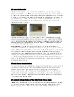
Best Practice: Ideally, games designed with the UMPC in mind should use text
sparingly and consider the UMPC screen size when choosing a font. Likewise,
icons should not rely heavily on fine details, so different objects are different
enough to be easily distinguished from one another, even on the smaller UMPC
screen. In places where increasing text size enough would compromise other
elements of the game, allowing text size to be adjustable may be a good
solution, allowing individual players to decide for themselves the ideal size for
the text.
2.2 Clickability of Buttons and Other Elements
Issue: Similar to the issue of small text, buttons and other clickable game
elements add complexity to porting games to the UMPC. That is, while the
overall interface on the UMPC must be smaller than the corresponding standard
PC version, the actual buttons in the UMPC interface must be larger, in order to
accommodate being accurately clicked by a stylus or finger, rather than the
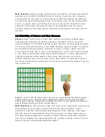
more precise mouse that is used in the standard PC version. As shown in Figure
1, this issue is particularly acute when multiple buttons or other elements are
clustered together, which makes it more likely that the user will select a
different element than the one they intend. Even when it is possible to select
the correct element with some care, this issue can significantly detract from the
user experience.
Figure 1.
On a 20-inch PC monitor (left), the user can easily identify and select a domino
using the arrow cursor. When the domino images are scaled to fit on a five-inch UMPC
screen (right), however, it becomes very difficult for users to select individual dominoes, or
even to identify how many dots are on each domino.
Best Practice: As with the size of text and icons, game developers should avoid
this problem by using large, distinct buttons and other elements. These
elements should also have enough space between them, making it less likely
that the user will inadvertently select the wrong one. In those cases where a
text label appears adjacent to a button or other element, that label should be
part of the clickable area associated with the element, making it easier to click
without having to devote any additional space.


