


13-17-621 Page 12
The Secondary buttons are outlined in blue with white fill. These buttons represent the less
common action(s) for a screen. For example, on a settings screen the
Cancel
button will be a
secondary button.
If a button is locked it will be shown as in the Primary Locked and Secondary Locked examples
above. This usually indicates that the appropriate access level is not currently logged in, but it
could also be locked because the current machine status does not allow the action, or the action
is not applicable to the machine configuration.
On / Off switches are used for settings that can be enabled / disabled. If the item is disabled, or
off, the switch
will show “Off” in blue with a white background. If the item is enabled, or on, the
switch will show “On” in white with a green background. Pressing the switch will toggle it to the
opposite state.
Several screens on the system utilize tabs to organize and categorize the information. An example of
these tabs is shown in Figure 6 below.
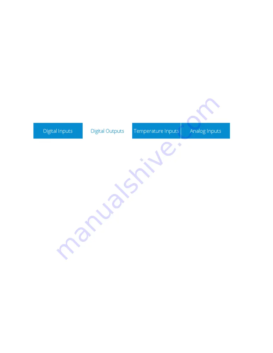
Figure 6: Tabs Style
The currently active tab is shown with a white background and blue text while inactive tabs are shown
with blue ba
ckground and white text. In the example above, “Digital Outputs” is the currently active tab.
Pressing on a tab will cause it to become the active tab if it is not currently selected.
3.1.3 Scroll Elements
The system uses two types of control for scrolling the values shown on a screen.
The first scroll element is shown in Figure 7 below. It operates much like a scroll bar on any other
application. Pressing the
V
on the bottom of the scroll bar will move the screen down. You can also drag
the scroll position indicator to move the position.
Summary of Contents for Governor
Page 37: ...13 17 621 Page 37 Figure 36 Trend Graph Setup...
Page 43: ...13 17 621 Page 43...


