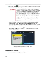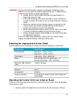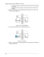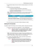
Power Graph
44
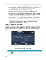
Figure 35. Power Graph Menu Tab
2.
The power graph displays the power information for each channel with a 6, 12
or 24 hour time scale. As runtime increases the power graph will
automatically update to the most appropriate time scale.
3.
The percentage of the maximum average power is plotted in the graph.
4.
The graph and power data will be displayed as zero if the therapy is stopped
for any reason (i.e. stop button pressed, cables disconnected, channel made
inactive).
See the figures below for examples of a power graphs.
5.
The power graph shows the total runtime for the channel, not for the device.
If possible, always reconnect devices to the same channels they started on.
If two devices are switched from one channel to another, the runtime will
reflect the total amount of time that specific channel delivered therapy
regardless of the device currently connected.
Screen Layout – Power Graph
Power Graph information is provided for each channel independently showing percent
of the maximum average power for the duration of the therapy. Additionally, the current
state of the device is shown by the colored channel icon (see Figure 36 and the table
below).
Figure 36. Screen Layout – Power Graph
Item
Description
Channel label (A and B):
Menu Tabs
Channel B
Power Information
Channel A
Power Information
Содержание EKOS
Страница 65: ...Symbols and Indicators 61 ...


