616
Using Data & Statistics
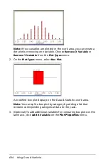
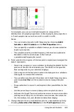
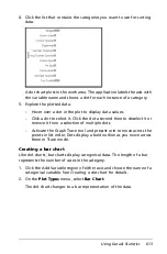
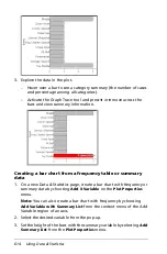
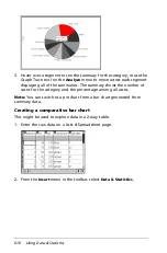
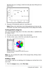
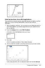
3. Hover over a segment to see the summary for the category, or use the
Graph Trace tool on the
Analyze
menu to move across each segment
displaying all of the summaries. The summary shows the number of
cases for the category and the percentage among all cases.
Note:
You can switch to a pie chart from a bar chart generated from
summary data.
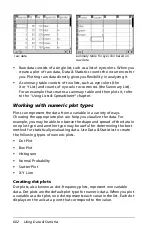
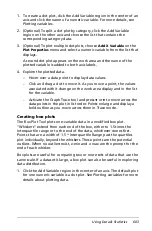
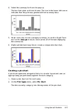
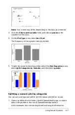
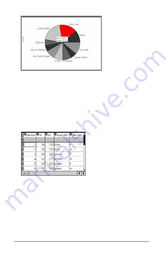
Creating a comparative bar chart
This might be used to explore data in a 2-way table.
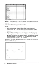
1. Enter the raw data on a Lists & Spreadsheet page.
2. From the
Insert
menu in the toolbar, select
Data & Statistics
.
Summary of Contents for TI-Nspire
Page 38: ...26 Setting up the TI Nspire Navigator Teacher Software ...
Page 46: ...34 Getting started with the TI Nspire Navigator Teacher Software ...
Page 84: ...72 Using the Content Workspace ...
Page 180: ...168 Capturing Screens ...
Page 256: ...244 Embedding documents in web pages ...
Page 336: ...324 Polling students ...
Page 374: ...362 Using the Review Workspace ...
Page 436: ...424 Calculator ...
Page 450: ...438 Using Variables ...
Page 602: ...590 Using Lists Spreadsheet ...
Page 676: ...664 Using Notes You can also change the sample size and restart the sampling ...
Page 684: ...672 Libraries ...
Page 714: ...702 Programming ...
Page 828: ...816 Data Collection and Analysis ...
Page 846: ...834 Regulatory Information ...
Page 848: ...836 ...


