


A
8-92
Desktop Color Primer
Color Reference Guide for C9800 - 92
Color and text
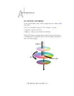
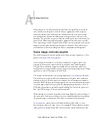
It is not a coincidence that the overwhelming majority of text you see is printed in
black on white paper. Text in black on white is highly legible and is not fatiguing to
read for extended periods. For many color materials, using black text on a white
background and confining color to graphic elements and headings is a good choice.
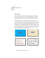
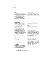
When used skillfully, color text can add flair to documents printed on paper.
This technique is widely used in presentations. When using color text, avoid dazzling
text and background combinations created from primary complements, especially red
and cyan or red and blue; they are visually fatiguing and hard to read. Color text is
more legible when distinguished from its background by a difference in lightness—for
example, dark blue text on a light beige background. In addition, using many different
colors in a string of text makes for a confused appearance and is hard to read. However,
using a single highlight color is an effective way to draw the reader’s eye to selected
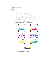
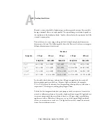
words. For color text samples, see the following figure.
STOP!
STOP!
Exceptio
pro
b
at
re
g
ulam de re
b
us
non exceptis.
De
g
usti
b
us
non
est
disputandum
.
Summary of Contents for C9800hdn
Page 1: ......