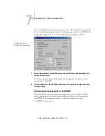


A
8-88
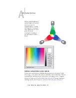
Desktop Color Primer
Color Reference Guide for C9800 - 88
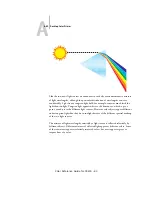
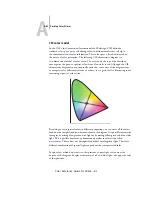
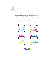
Even if your color printing is done exclusively on the Fiery, you will encounter
concepts from offset printing if you use high-end graphics applications. For example,
color controls in illustration applications, such as Adobe Illustrator, are geared toward
specifying color for offset printing using process and
. Many applications
allow you to specify the screening used for each printing plate.
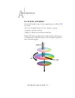
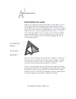
Using color effectively
The ability to print in color can greatly increase the effectiveness of your message,
whether you are printing a presentation or newsletter (short-run printing), or proofing
an ad concept that will later be printed on a press (color proofing). Some potential
benefits of using color include:
• Conveying information rapidly by using color cues
• Making use of the emotive aspects of different colors
• Increasing impact and message retention
Color can also be a source of distraction and discord if it is used poorly. This section
outlines some tips and concepts to consider as you approach designing color materials.
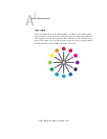
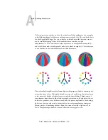
A few rules of thumb
Try some of the following strategies for creating successful color materials:
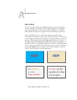
• Use color to aid comprehension, rather than applying colors indiscriminately.
In color presentations, graphs, and charts, use color to highlight patterns and
emphasize differences.
• Use color sparingly. In general, fewer colors work better than many colors.
• Use red as an accent color. Red is particularly effective when used in otherwise
monochromatic materials.
• Consider the tastes of your target audience when choosing colors.
• Keep a file of printed color pieces that appeal to you or strike you as effective.
Refer to it for ideas when designing your own documents.
Summary of Contents for C9800hdn
Page 1: ......