How To…
5
Other Software Features
Many actions that are completed using the menu buttons on the computer are done using the touch screen capabilities
on the tablet.
Zoom
–enlarge/reduce a section of the graph using a two finger pinch or push motion. You can stretch/shrink the graph
from side to side, from top to bottom or on a diagonal enlarging/reducing the graph while
maintaining the same proportions. There is a reset arrow at the upper right of the screen.
Marker
–set markers on your graph by touching the anywhere along a data line. In addition to the marker, a pop up
bubble with the specific value at that point is added. You can move the marker along the line by touching and sliding the
marker along the line. The values within the bubble will change as you move the marker. You can also relocate the
bubble by touching and dragging it anywhere within 360 degrees of the marker. To remove a marker, touch and hold
the marker and select “delete” from the pop up window. You may wish to zoom in/enlarge the screen before doing this,
as the touch needs to be directly on the marker. Only two markers can be set on the screen at one time.
Annotate
– add labels to your graph to explain what is happening on the graph by touching and holding on the screen,
anywhere that is
not
on the data line. A pop up bubble is placed on the screen. To add text (or to delete an annotation),
press and hold on the bubble. To move the text portion of an annotation, press and drag the bubble anywhere within
360 degrees of its insertion point. You can also lengthen/shorten the leader to the text by dragging the text bubble
closer to/further from the insertion point. To move the entire annotation, press and drag from the tip of the insertion
point.
At this point in time,
it is not possible to add an image to an annotation using Globilab on an Android tablet.
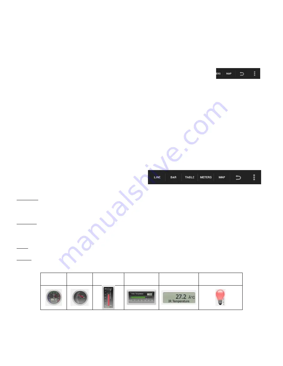
Display Options
– are found in the upper right hand corner of
the screen and allow you to select the format for data
display. These include:
Line graph – if there is data of more than one type displayed, you can choose which lines to view by tapping on the
legend in the upper right hand corner. In the pop up box, you can select line color, format (line or individual data points)
or choose to hide a particular set of data.
Bar graph –bar graphs will show data from only one sensor at a time. To change which data is displayed tap on the
legend in the upper right hand corner. In the pop up box, you can select which set of data to display or change the color
of the data currently displayed.
Table –shows data that in a chart format. This can be used to view exact measurements for every collection.
Meters – Meters are best used when the Labdisc is connected to the computer during the data collection since they
show changes in the data values as are they are happening. There are several different options for meters including;
Full Dial
Half Dial
Vertical
Bar
Horizontal
Bar
Numeric
Readout
Red, Blue & Green
Colorimeter Bulb
To change between different meter types or to adjust the range of a meter, tap on the meter to open a pop up window
where you can select options.


