


Revision 14
88
August 02, 2019
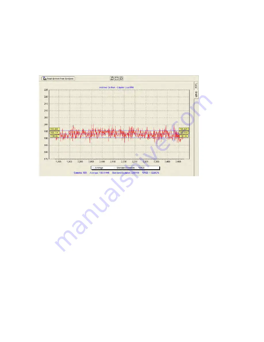
5.7.2 The Graph Format
The data in the white columns can be graphed by right clicking and dragging down to select
the desired portion of a given data column. Once the data of interest has been selected, click
on the
Graph Selected
button at the top of the screen. This will create a graph that shows the
trend in the selected data (e.g. Figure 5-13).
Figure 5-13: Charted Data
There are 3 blue dashed lines on the graph:
•
The solid blue line in the middle shows the average of the selected data,
•
The 2 dashed blue lines above and below the central line show one standard deviation
away from the mean in both directions.
The yellow boxes at either end of the plot adjacent to solid blue line contain the numerical
value of the average.
The yellow boxes at either end of the plot adjacent to the dashed blue line above the average
contain the numerical value of the average plus 1 standard deviation, and the yellow boxes at
either end of the plot adjacent to the dashed blue line above the average contain the
numerical value of the average minus 1 standard deviation.
The numerical values of the statistics presented below the chart include the number of data
points (samples), the average, the standard deviation, and the standard deviation, in percent,
relative to the average.
The three buttons on the
Chart
window are described in Table 5-7.
Summary of Contents for ProTech903
Page 2: ......
Page 96: ...Revision 14 96 August 02 2019 Figure 5 19 Event Log...
Page 122: ...Revision 14 122 August 02 2019 Figure 5 38 Typical Modicon with Floating Point List...
Page 124: ...Revision 14 124 August 02 2019 Figure 5 40 Expanded Modbus Nodes...
Page 175: ...Revision 14 175 August 02 2019 Figure 9 17 Non Isolated 4 20 mA Inputs...
Page 190: ...Revision 14 190 August 02 2019...


