7
69
Eversense CGM User Guide
Trend Graph
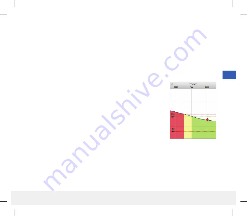
The trend graph is used to review and analyze historical data and trends in your glucose values over time. It also
displays marks for events you have manually logged in the app (e.g., calibration tests and exercise).
There are several ways you can use the trend graph:
•
Quickly review how well you are doing when compared to the glucose targets and alert levels you set. The red
dashed lines indicate your High and Low Glucose Alert levels, and the green dashed lines indicate your high and low
glucose target levels (your target range).
•
Shaded areas of the graph are color coded as follows depending on the glucose settings you enter:
– Glucose values that are
outside of your glucose alert levels
will be red.
– Glucose values that are
within your glucose target levels
will be green.
– Glucose values that are
between your glucose target and alert levels
will be yellow.
•
Press and hold any point in the line graph to view a specific glucose reading
for that point in time.
•
Tap any of the marks on the app screen to get more information about the
event or alert.
•
Pinch in and out on the screen to display different day/time ranges on the
trend graph. You can zoom in and out to display as few as 3 hours or up to
3 days of information.
•
To view trend graph data for a different date, tap the date on the screen and enter the desired date.
•
You can view the trend graph in either portrait or landscape mode. In landscape mode, there are shortcut buttons to
see 7, 14, 30 and 90 day views.
Note:
All of your glucose data will be stored in the app as long as you have memory available on your mobile device.
LBL-1602-01-001 Rev N_Eversense User Guide_mgdL_R1.indd 69
LBL-1602-01-001 Rev N_Eversense User Guide_mgdL_R1.indd 69
2/26/20 12:59 PM
2/26/20 12:59 PM


