CE870 Instant Issuance System Installation and Administrator’s Guide
49
Print Text in Monochrome
Printing text using a K panel can make text look crisp, because it uses only one panel for printing.
Fine text is more readable when printed with more power. You set the power for the K panel
using Printer Manager. Refer to
for more information.
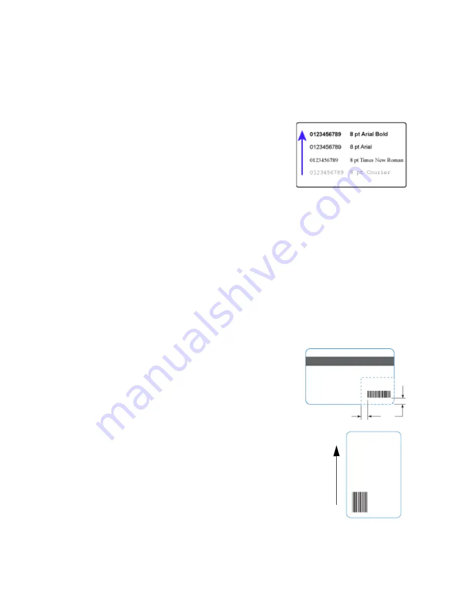
The font used also affects legibility. The printer reliably prints
6-point Arial font. Bold, sans-serif fonts are more readable
after printing than serif fonts, or fonts with thin strokes, as
shown at right. In the example, fonts that print well are
shown toward the top of the card.
Print Bar Codes
Bar code design follows a set of standards based on the type of bar code produced. Bar codes
contain a series of black lines (bars) separated by white areas (spaces). Each character of encoded
data is represented by a set of bars and spaces. A bar code standard specifies the number and
width of bars and spaces needed to encode a character. The standard also specifies the minimum
size of the white area, or quiet zone, that surrounds the bar code.
Bar Code Guidelines
Bar codes print more successfully when you observe the following guidelines. Follow the
standards for the type of bar code you are printing.
Bar Code Placement
Maintain the required quiet zone around the actual bar
code, as shown in the illustration.
Locate bar codes at least 0.25 inch (6.3 mm) from other
printing and from the edge of the card.
For best results, orient the card so that the bars are parallel
to the long edges of the card, as shown. This orientation
most accurately prints readable bar codes.
0.25 in
6.3 mm
quiet zone


